
Isn't it fun to pick colors? The first part of deciding which color is the easiest part, but when you start looking at ALL THE SHADES in that color.... sigh....
I'm working on finally painting the kitchen, dining room and living room. Yay!
Here's some before pics...


Unfortunately, not a lot has changed since then... Yeah, it's been almost 5 years... :/
But, recently we took down all of the curtains and put up 2 1/2 in. faux wood blinds. Which, by the way, I LOVE! We had quite the process to go through, that center window with the arch was a challenge.
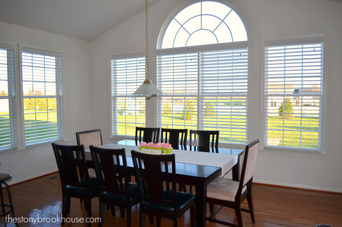
Don't they look great! I'm still amazed at how much brighter the rooms are. I also put them in the living room. Soooo, much better!
So, now we are getting ready to paint! YES!
First, we needed to pick the neutral that is going pretty much everywhere, except for 2 accent walls. This neutral is going from the kitchen/dining area to the living room all the way to the front door and up the stairs.
We wanted something that wasn't white, but not too dark, just the right color to make the trim pop white. Do you know what I mean?
Okay, here's a picture.

First, I tried a color we used in our old house and we loved it there. I happen to have an old can of it in the basement. It was Valspar's Cream In My Coffee. It was too light, in fact you have to look really hard to see anything in the picture.
So, I went to Home Depot and picked up a bunch of paint chips, looked on Pinterest...yada, yada, yada... We finally picked one and got a sample. It was Behrs Sculptor Clay. That's the top color. Hmmm...
Yeah, hubby and I agreed. Too dark. We don't want to live in a cave.
So, back to the drawing board. We wanted one kinda in the middle. Back to Home Depot for another sample.
I have to tell you, I am sold on samples! I never used to get them! Before we'd just pick a color and go for it. This is sooo much better! Especially for $3!
I have to tell you, I am sold on samples! I never used to get them! Before we'd just pick a color and go for it. This is sooo much better! Especially for $3!
Success!
This one seems perfect, it's kinda a gray/tan depending on the light. It is Glidden Natural Wicker, which I had mixed in Behr paint. I painted it on a few walls to see how it would look under different lighting.


Whew! All that for the neutral. The accent should be a breeze right?
Well...in a perfect world...
We are going to use blue as an accent wall color.
So, first I tried the blue I used in the powder room. Remember the stripes? Here's the Powder Room Reno.

I still love this! But the blue seems to be too bright out in the dining room. So we tried another more smoky blue called Behr Salt Glaze, well... No, that didn't work.
Then I discovered that if you go to www.Behr.com, they have rooms you can add paint to. It gives you a feel for colors. So, when I went back to home depot I had a list of colors to look for.
Little did I know these were all "new" colors and weren't on the sample wall yet. The salesman was very helpful and He opened a new thingy with all the new paint chips. We found all of them and compared them and picked one out. Here's what the 2 looked like. Very different from each other.

Beach Foam is the winner!
We will be painting the fireplace wall and the wall in the dining room with the arch window the Beach Foam blue. I seriously can't wait!!

Hmmm.... Options.... We picked one.
I'm going to try and share that fiasco this weekend! :P
Update: We didn't end up using that tanish "Natural Wicker". We went with something totally different!! Check that out here.
And if you want to see our front door... Here it is...
Blessings,
